CLIENT
The Collective Newsletter
SERVICES
Strategy
Positioning
Creative Direction
Brand Identity
Email Template
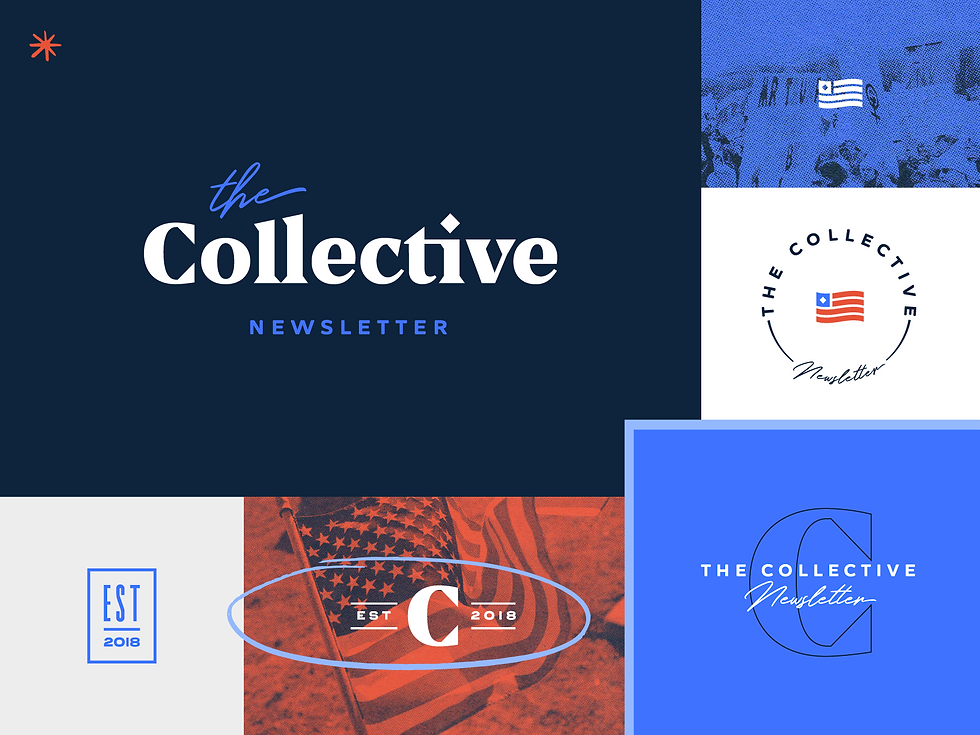
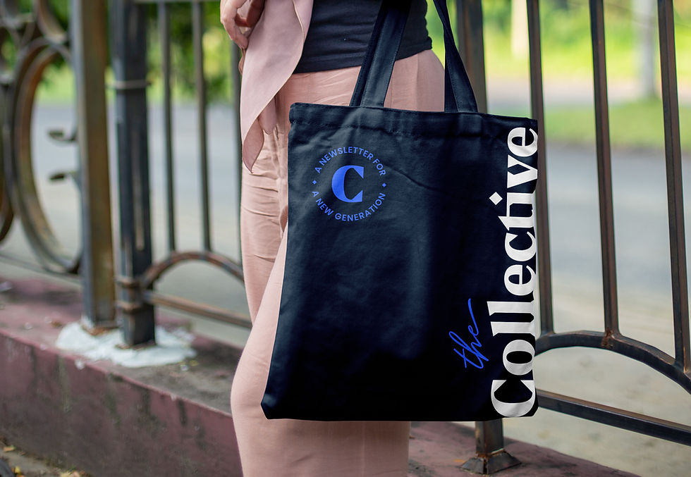
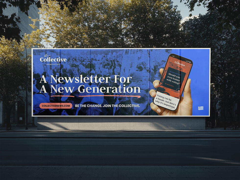
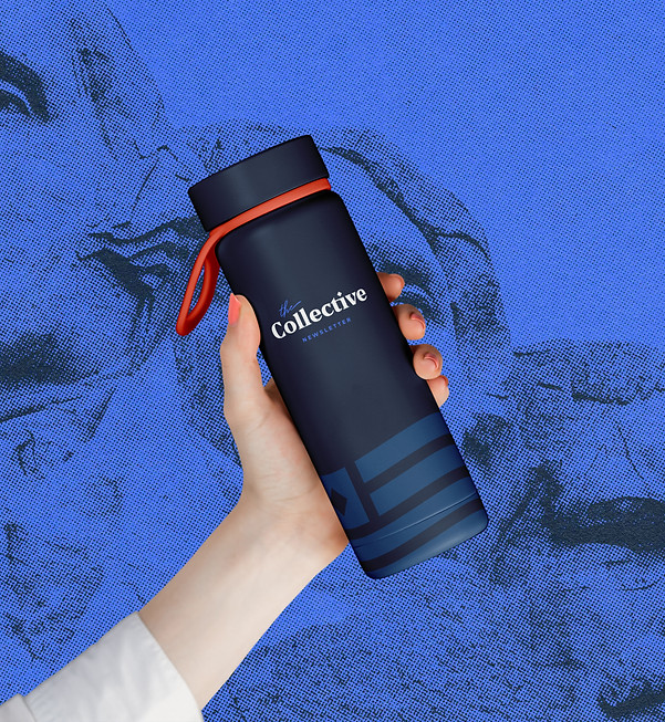
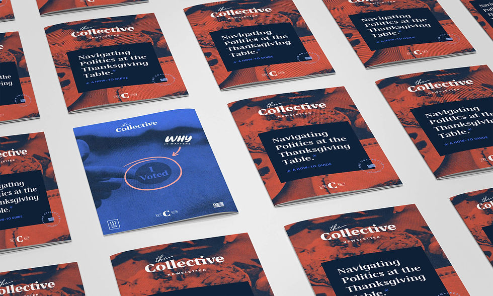
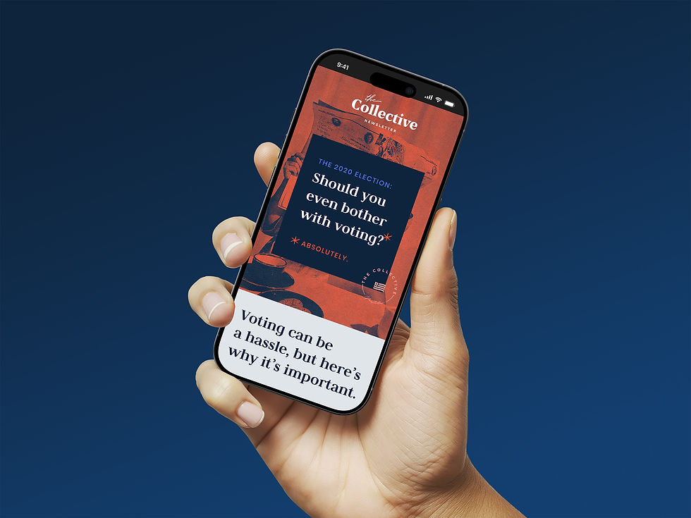
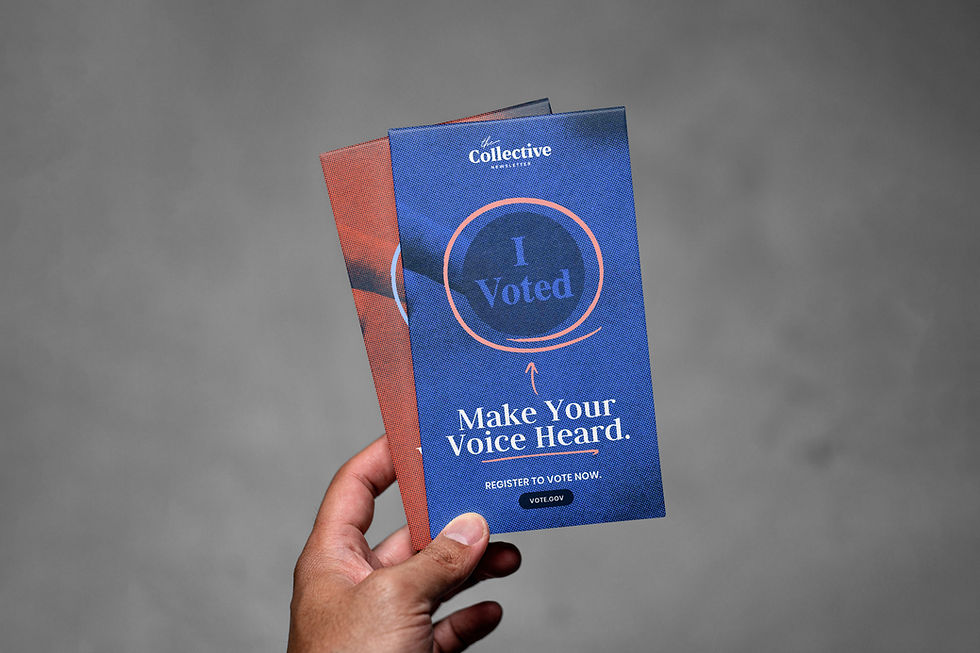
The Collective was a startup newsletter delivering bite-sized political and world news to a younger generation of readers. With a tagline like “A newsletter for a new generation,” their mission was clear: give 20–30-somethings quick, unbiased news without the noise of opinion pieces or spin. As a new venture, they needed a brand identity that communicated clarity, credibility, and relevance—without feeling stale or overly traditional.

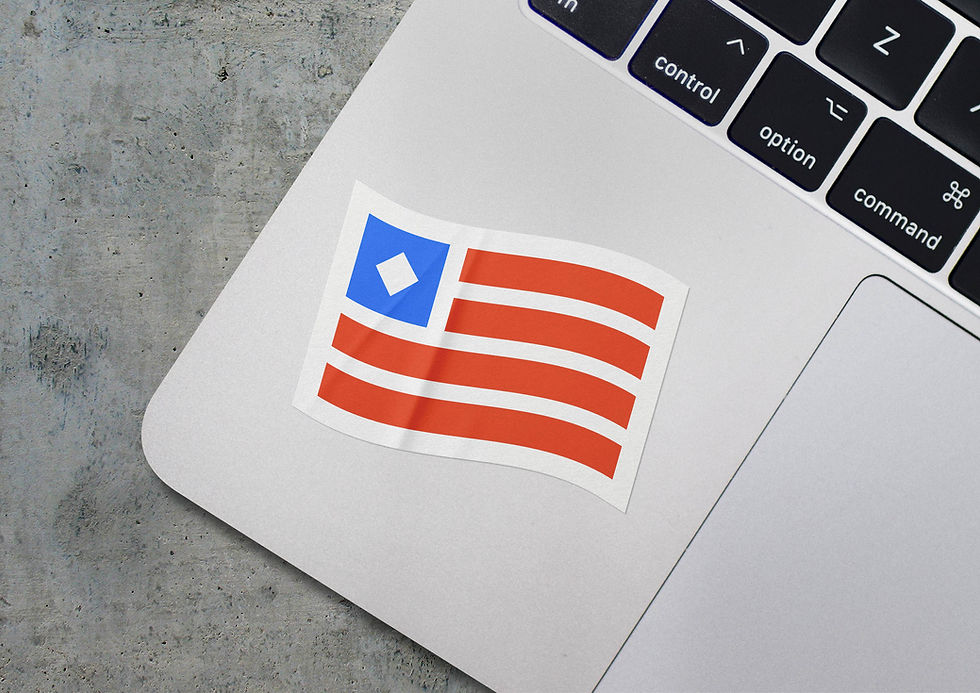
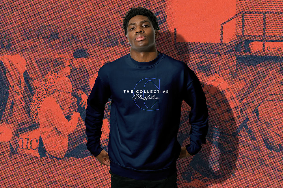
To bring The Collective’s mission to life, I created a brand identity that blended boldness with grit. The visual system pulls from traditional news cues—like a red, white, and blue color palette and a sharp, serif typeface reminiscent of legacy publications—but subverts them with unexpected accents of pink and baby blue, halftone textures, and hand-drawn underlines and circles. This mix of polished and imperfect helped strike a balance between credible and current.
The typography paired a dramatic serif with rugged, human touches to feel grounded and youthful. And by giving red and blue equal visual weight, the brand subtly reinforced its commitment to political neutrality.
The end result was a news brand that felt trustworthy without being boring—and modern without losing its journalistic roots. The team loved the final brand and used it consistently throughout the lifespan of the newsletter.


Solution
We built Caret’s brand from the ground up, including brand strategy, logo design, typography, color palette, brand marks, presentation templates, and a fully responsive website. The logo mark draws inspiration from the caret character (^)—a subtle nod to growth and direction—paired with a custom wordmark that feels bold and modern.
To hint at their name (and the idea of “dangling the carrot”), we introduced orange and green as accent colors, keeping the core palette grounded in deep gray and off-white to maintain a tech-forward, professional feel. The design leans into a dark, minimalist aesthetic with line-based illustrations and extended, blocky type that reinforces clarity and confidence.
The result is a brand that cuts through the noise—sleek, strategic, and intentionally different from typical lead-gen brands. Using our one-concept method, the Caret team signed off with minimal revisions and were thrilled with the final direction.